Stop flying blind: data visualization for AI-powered marketing tools
See the story your AI marketing data tells. Data visualization reveals hidden patterns, improves decisions, and drives growth.
Alexi Carmichael
Business, Mentorship, and AI Verified By Expert
Published: February 12, 2025 | Updated: July 11, 2025
You’re likely investing heavily in AI-powered marketing tools. You’re collecting data on customer behavior, ad performance, social media engagement, and more. But are you truly seeing the story your data is telling? If you’re relying on raw data or generic dashboards, you’re flying blind. You’re missing out on crucial insights that could dramatically improve your campaign performance and boost your ROI. The solution isn’t just more data; it’s smarter data.
AI-powered marketing tools generate massive amounts of data, but without visualization, you’re missing crucial insights.
Data visualization transforms complex marketing data into actionable strategies, leading to better campaign performance and higher ROI.
Elementor and SvelteJS are powerful tools for building user-friendly and high-performance marketing dashboards, but the right development expertise is key.
Specialized development teams can help you build custom visualizations that reveal hidden patterns in your customer data, optimize your ad spend, and personalize your marketing efforts.
Don’t just collect data; understand it. Data visualization is the key to unlocking the full potential of your AI-powered marketing tools.
It’s about transforming that complex information into clear, actionable insights through data visualization. This isn’t about pretty charts; it’s about making data meaningful and useful for your marketing team. And it’s not as complicated as you might think. With the right tools and expertise, you can unlock the full potential of your AI-powered marketing platform.
The Data Deluge (and Why It Matters):
The marketing industry has been fundamentally transformed by AI. Tools for automated ad bidding, personalized content recommendations, predictive analytics, and social media listening are generating unprecedented amounts of data.
You’re likely tracking website clicks, email open rates, conversion rates, social media mentions, customer demographics, purchase history, and a whole lot more. This data should be a goldmine, but without the right tools to interpret it, it’s just noise.
Beyond the vanity metrics:
Many marketers get caught up in “vanity metrics” – numbers that look good on paper but don’t actually drive meaningful results. You might be tracking likes, shares, or followers, but are these metrics translating into actual sales or customer loyalty? Data visualization helps you move beyond these superficial measures and focus on the metrics that truly matter to your bottom line.
The Power of Seeing:
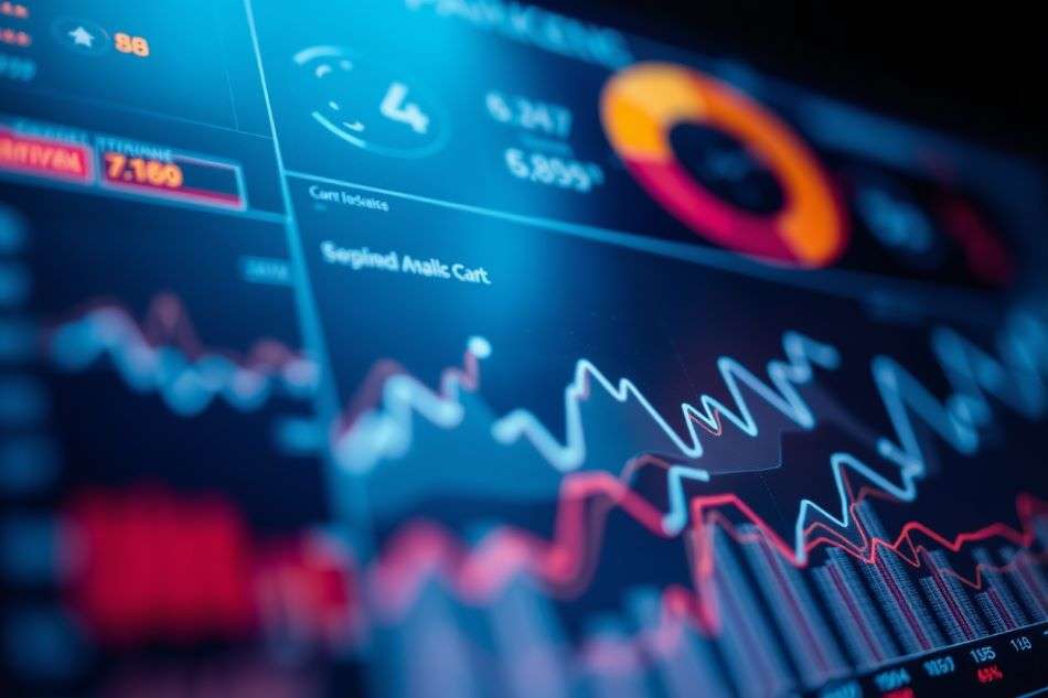
Data visualization transforms raw data into visual representations – charts, graphs, interactive dashboards. This isn’t just about making data look pretty; it’s about leveraging the way the human brain processes information. We’re wired to understand visual patterns far more quickly and efficiently than rows of numbers. A well-designed visualization can reveal hidden trends, correlations, and outliers that would be impossible to detect in a spreadsheet. This allows you to make faster, more informed decisions about your marketing campaigns.
Your visualization Toolkit (and why you need experts)
Elementor: building user-friendly marketing dashboards
Elementor, a popular website page builder for WordPress, might seem like an unconventional choice for marketing dashboards. But its intuitive drag-and-drop interface and extensive customization options make it surprisingly powerful. Think of it as a way to create a custom control panel for your marketing data:
No-Code (or Low-Code) Dashboards: Elementor allows even non-developers to create and modify dashboards without needing to write complex code. This empowers them to explore data and answer their own questions. However, for more comprehensive dashboards we recommend to hire elementor developers that can make the learning curve much shorter.
Customization is Key: You can tailor your dashboards to display the specific metrics that are most important to your campaigns. No more generic reports; you get exactly the information you need.
WordPress Integration: If your website or blog runs on WordPress, which most do, Elementor integrates seamlessly, allowing you to leverage your existing infrastructure.
Extending Functionality: Elementor’s plugin ecosystem includes add-ons for advanced charting and data connections, giving you even more visualization options.
SvelteJS: Performance and Interactivity for Real-Time Insights
SvelteJS is a modern JavaScript framework that’s built for speed and interactivity. Unlike traditional frameworks, Svelte compiles your code into highly optimized JavaScript before it’s deployed. This means to truly leverage its capabilities, you may want to hire SvelteJS developers. Here’s why that matters:
Blazing-Fast Performance: Even with massive datasets from your marketing campaigns, SvelteJS dashboards will load quickly and respond instantly to user interactions. No more waiting for data to load; you get real-time insights.
Dynamic and Interactive: Imagine a dashboard where you can filter data by customer segment, zoom in on specific time periods, and see the changes reflected instantly. SvelteJS makes this level of interactivity possible.
Reusable Components: Svelte encourages building reusable components, allowing your development team to create a library of visualization elements that can be used across different dashboards and projects, saving time and ensuring consistency.
Optimized for Mobile: Svelte’s small footprint ensures your dashboards work flawlessly on any device, allowing your team to access insights on the go.
Alternative Visualization Tools:
While Elementor and SvelteJS offer a powerful combination of user-friendliness and performance, the data visualization landscape is diverse. Other options you might consider include:
React (with Charting Libraries): React is a popular JavaScript library for building user interfaces. Combined with charting libraries like Recharts, Chart.js, or Nivo, it provides a flexible and powerful platform for data visualization. It’s a good choice for complex, custom-built dashboards.
Vue.js (with Charting Libraries): Similar to React, Vue.js is another popular JavaScript framework that can be used with various charting libraries. It’s known for its simplicity and ease of learning.
D3.js: D3.js (Data-Driven Documents) is a low-level JavaScript library that gives you granular control over every aspect of your visualizations. It’s incredibly powerful but has a steeper learning curve than other options. It’s best suited for highly customized and complex visualizations.
Tableau: Tableau is a leading business intelligence and data visualization platform. It’s known for its user-friendly interface and powerful analytical capabilities. It’s a good option for creating interactive dashboards and reports, but it can be more expensive than other solutions.
Power BI: Microsoft Power BI is another popular business intelligence platform that offers a wide range of data visualization tools. It integrates well with other Microsoft products and services.
The Expertise factor: why you need a specialized team
While these tools are powerful, they’re not magic wands. You need developers who understand not only the technical aspects of coding but also the nuances of data analytics and the principles of effective data visualization. This is where specialized development teams with multi-disciplinary backgrounds become essential. They bring:
Marketing data expertise: They understand the key metrics that drive marketing success and can help you design dashboards that focus on the right information.
Visualization best practices: They know how to choose the right chart types, design intuitive interfaces, and avoid common data visualization pitfalls.
Custom solutions: They can build custom integrations with your AI-powered marketing tools, ensuring that your dashboards display the most up-to-date and relevant data.
Ongoing support and optimization: They can provide ongoing support and maintenance, ensuring that your dashboards continue to meet your evolving needs.
Real-World examples: Leveraging marketing insights for better ROI
Let’s move beyond the theory and look at some concrete examples of how data visualization can transform your AI-powered marketing efforts:
Optimizing Ad Spend: Imagine you’re running a Google Ads campaign. A SvelteJS-powered dashboard could visualize your cost-per-click (CPC), click-through rate (CTR), and conversion rate for each keyword and ad group. You could instantly see which keywords are performing well and which are wasting your budget, allowing you to reallocate your spend for maximum ROI.
Personalizing Customer Experiences: Your AI-powered recommendation engine is generating data on customer preferences. An Elementor dashboard could visualize this data, showing you which products are most popular with different customer segments. You could then use this information to personalize your email marketing campaigns, website content, and product recommendations, leading to higher engagement and conversion rates.
Identifying Social Media Trends: Your social media listening tool is tracking mentions of your brand and your competitors. A SvelteJS dashboard could visualize this data, showing you which topics are trending, which influencers are driving conversations, and how sentiment towards your brand is changing over time. This allows you to proactively respond to trends and adjust your social media strategy accordingly.
Predicting Customer Churn: Your AI-powered predictive analytics tool is identifying customers who are at risk of churning. A dashboard could visualize this data, showing you the key factors that contribute to churn and allowing you to proactively intervene with targeted offers or support.
The future of marketing is undeniably data-driven, but raw data alone is a missed opportunity. It’s like having a treasure map but no ability to read it. You need to be able to see the story your data is telling, to uncover the hidden patterns and insights that can transform your campaigns. Data visualization is no longer a “nice-to-have”; it’s the essential lens through which you can understand your customers, optimize your strategies, and achieve real, measurable results. Stop relying on guesswork and intuition. Embrace the power of data visualization and transform your marketing data into actionable insights that drive growth and a significant return on your AI investments.
Alexi Carmichael
Business, Mentorship, and AI Verified By Expert
Alexi Carmichael is a tech writer with a special interest in AI's burgeoning role in enhancing the efficiency of American SMEs. With her know-how and experiences, she has since taken on the role of mentor for fellow entrepreneurs striving for digital optimization and transformation. With Tech Pilot, she shares her insights on navigating the complexities of AI and how to leverage its capabilities for business success.
Share This Article
JOIN OUR COMMUNITY
Receive the latest AI insights directly to your inbox.